Presentation to the team
It is best to present conclusions , macro trends or performance each on a single page.
If you need to present data to the planning team, use graphics. People tend to be more decisive when they analyze graphical data rather than lists of numbers.
Conclusions on a Single Page
Over many years, I've seen two very effective methods to present conclusions to a team:
Pro and Con Summaries
State the conclusion in one very short paragraph, then make the comparisons by listing the advantages ("pros") and disadvantages ("cons").
Quantitative Summaries
State the conclusion in one sentence at the top of the page. Make the comparisons easy to spot, with side-by-side or overlay graphics.
In a perfect world it is best to combine them on a single page: recommendation, pros/cons, and graph.
Macro Trends on a Single Page
Preparing a clear quantitative graphic is a challenge. My rules are:
- Use the same scale with either absolute values or percentages (relative values) on the vertical axis
- Use the same starting point in time for the entire event in context
- Use side by side or overlay comparisons, but not too many
Your job as the decision maker or the positioner is to understand what the data is telling you.
Here are examples, which played a significant part in the 2012 US Presidential Election show how to present data using a graph and how to judge the quality of the data: am I comparing apples to apples, is the start point reasonable in context and what am I comparing?
In the 2012 Presidential campaign, three highly respected economists used different approaches to measure "how well the United States is recovering" from a severe, systemic financial crisis. They dueled to be the most persuasive, which offers us best practice advice.
Their two fundamental measurement techniques were:
- rate of change from the pervious year to emphasize "effort", and
- time to attain a performance measure compared to the past, to emphasize "how long under the circumstances"
I am going to critique their presentations using my rules and then suggest a best practice source.
John Taylor on
Effort Compared to Last Year
He used the same scale, the same starting point without context, percentages when comparing Obama to Reagan's performance.
Taylor presented data on job recovery to the U.S. House Committee on the Judiciary on September 20, 2012 in "Government Regulatory Policies and the Delayed Economic Recovery." He said we were doing lousy, the rate of improvement from each past years under Obama was not good as Reagan's. He compared the growth in jobs from the end of the 1982 recession (Reagan) to from the end for 2007 recession starting in 2009 (Obama).
Taylor focuses on the effort creating jobs, comparing those working as a percent of the population between Reagan and Obama and blames Obama for over-regulation.

The starting points are suspect since he compared Presidents from the end of the recessions without context of the depth and length of the recessions.
Here is the civilian employment-population ratio since 1948. Since 2001, the trend has been that fewer civilians are working as a percentage of the population and the GR accelerated that effect.

The drop in GDP during the 2007 recession and the 1980 and 1981 recessions on first glance are similar so the starting points are reasonable, but the causes of the recessions, the context, were not similar.
Eyeball regression (yellow line) indicates GDP growth per quarter has declined since the early 1980s. The US has not grown rapidly coming out of recession for many years. The economic cycle does not parallel the presidential election cycle.

Score on my rules:
- Excellent using same scale
- Poor staring points, not the entire event in context (not apples to apples)
- Therefore, poor side by side comparisons
Result, Taylor's presentation was criticized by other economists as misleading.
Carmen M. Reinhart and Kenneth S. Rogoff on
How Long Under the Circumstances
They used one scale, the same starting point using a normalization technique allowing for many comparisons in context and compared how long under the circumstances to attain the same performance peak to peak.
Three weeks later on October 14, Reinhart and Rogoff restated their approach the measure the time to recovery using real per capita GDP from their 2009 book "This Time It's Different," and concluded that this time it is not different to other US severe financial crises.
They disagreed with Taylor on how to make the comparisons, the context, where the 1981 recession was not like the 2007 recession, from a severe financial crisis with the precursors: a real estate bubble, high levels of debt, chronically large current account deficits, and signs of slowing economic activity. The 1981 recession was a double dip, a business cycle recession (I think caused by residual effects of Volker (the FED) constraining high inflation, leading to the sharp drop in GDP).
Reinhart and Rogoff measure recovery from a severe financial crisis by how long it takes to achieve the same level of real per capita GDP seen in the onset of the financial crisis.
Since the decline from the peak per capital GDP usually lags the onset of the financial crisis, their charts start from the peak year rather than end of the recession and measure the years since peak Year 1. They show the entire event. Next, this peak year real per capita GPD is normalized to 100 so you can compared different recoveries in different time periods from the same starting point.
Here they compare the 2007 crisis to two groups (averaged) of past severe crises in the USA with emphasis on how long for our society to recover. The green line shows five years from peak, we are doing just a bit better but not there yet. (In the return to mean chart above uses GDP dollars not per capita GDP.)
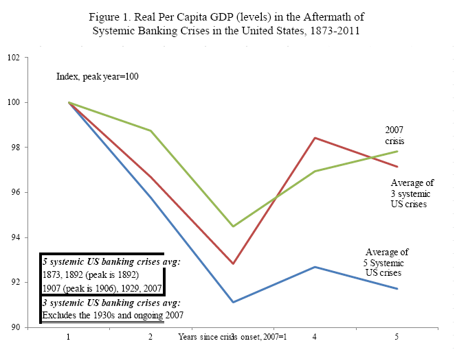
Score on my rules:
- Excellent using same scale
- Excellent, same starting points, here normalized so the relative performance is clear and the comparisons cover entire events
- Excellent in side by side comparisons, return to peak
Then the Taylor v Reinhart and Rogoff dust up is joined: Ezra Klein pipes in 10/15/2012 "compared to what", Krugman a few days later on out of context, and Papell and Prodan carefully dissect the Taylor and R&R's back and forth and their methods on 10/23. Their concerns parallel to those of my adapters, positioners and aligners' perspectives.
Best Practice Examples
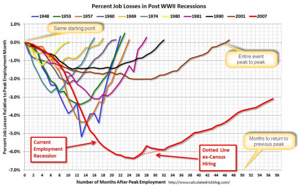
Another superb presenter of economic information is Bill McBride (www.calculatedriskblog.com and www.crgraphs.com).
His example on recovery is how long to recover from the job losses. McBride presents months to job recovery from the last peak employment month as the starting point to return to a baseline (as a percentage, here 0%). The technique is similar to Reinhart and Rogoff's.
Note that the longest recovery periods are 1957, 1981, 1990, 2001 and 2007. The pattern is that it is taking longer to recover from job loses.
Click chart to see other examples
Score on my rules:
- Excellent, using same scale
- Excellent, same starting points, normalized so the relative performance is clear and covers entire events
- Excellent side by side comparisons, peak to peak
 Using this technique, a business could compare product roll out, sales patterns, fund raising, etc. I'll leave it to you to determine your baseline. Using this technique, a business could compare product roll out, sales patterns, fund raising, etc. I'll leave it to you to determine your baseline.
If you need to blend absolute and relative values or different scales, then have right and left vertical axes, but do so with care.
On the next page, Presenting Performance.
 Relative data
 |
|
Continued
Presenting Performance

|
|