Your financials

First, if you aspire to senior management, you must be fluent with financial data.
Take one of two American Management Association courses, either
- Financial Analysis Seminar # 1552, or
- Fundamentals of Finance and Accounting for Non-financial Managers Seminar # 2218
The financial presentation to the planning team involves a comparison overtime between you and either a national benchmark, an industry benchmark or your direct competitor.
Later, as you propose a strategy, I'll show you how to estimate a strategy's value.
A Strategic Planner's Responsibility is to Anticipate Consumer Demand -
Start with National Benchmarks
How do your sales compare to the US consumers national spending and savings patterns?
The best national measure of consumer spending is personal consumption expenditures (PCE), measured monthly by the Bureau of Economic Analysis (BEA) as household expenditures on durable and non-durable goods and services. The approach is to use the PCE percentage change to the same time period the previous year and compare it to other data.
Nominal PCE includes the effects of inflation or deflation (called the PCE deflator in BEA speak), business and consumers' behavior reacting to their purchasing power. If inflation growth is greater than improvements in PCE from earnings, you are losing purchasing power. When inflation slows, everything else being equal, real PCE increases and you are gaining purchasing power. Real PCE is calculated by subtracting the PCE deflator from nominal PCE.
One choice in making comparisons is do you use nominal PCE or real PCE? Study how both computations to observe that consumer expectations about inflation/deflation impacts demand, PCE including inflation/deflation has larger swings, real PCE troughs lead the end of recessions a bit and real PCE improvements YoY are trending down.
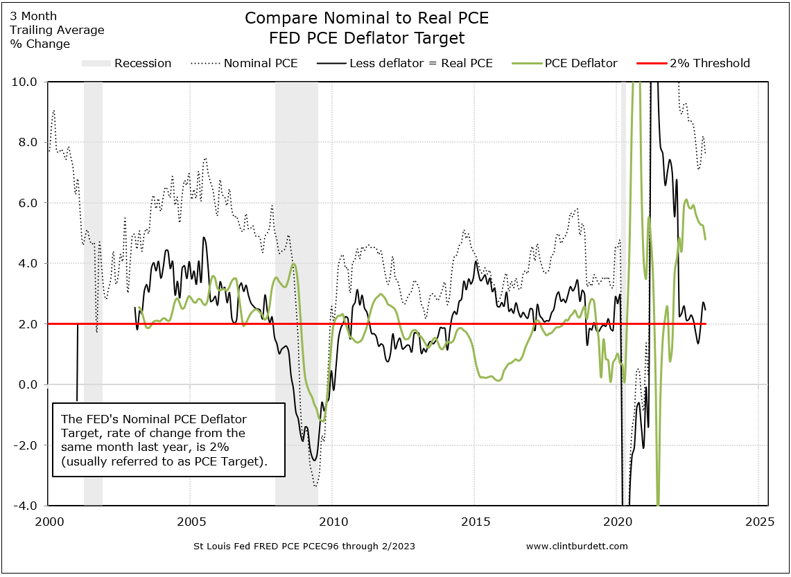
(Click for larger image)
But this first chart may be too busy; I present too many comparisons; and the time frame is too short. Is business data ever accurate enough and long term enough to to extrapolation into the future? For most, particularly if you are growing fast, data more than two years old may not be relevant. The real value is in constructing a customer profile to understand how the economy affects their buying decisions.
Find PCE data at the St Louis Fed's online FRED data sets: for monthly real PCEC96 from 1996 and nominal PCE from 1959 and quarterly real PCECC96 from 1947.
The next chart compares real versus nominal PCE in dollars (not same period last year to this year percentage change). On this chart notice first how passing through most recessions, our society continues to see improvements in PCE, in our capacity to purchase more goods and services, until the Great Recession. Second before the mid-2000s, PCE improvements were more from wage increases. Theses comparisons are simpler to explain and the implications disturbing.

(Click to go to StLouisFed FRED graph editor)
FRED charts from StLouisFed.org/FRED can be embedded in a web page using the link selection on the FRED edit page and can be set to provide the latest available data.
Charting and Presentation Techniques
To answer my earlier question, if there is sufficient data to compare to a baseline, many analyst report the percentage change in real PCE compared to the same quarter last year (often written "same quarter year on year"). There is too much noise in same month to previous year comparisons. If I have same month to previous year data, I average the trailing three months (-2m, -1m, comparison month)/3 to smooth the line, converting it to a quarterly moving average of the percentage change.
I use line rather than column presentations so data can be overlayed. This next chart would be my introduction to the team about the technique and uses nominal PCE with trailing 3 months for smoothing compared to starts and ends of recessions. In this example, I want to present behavior including societal perceptions of inflation and to keep the chart very simple.
Note the relationship between troughs in the nominal PCE YoY percentage change (red circles to highlight the trough, except in 1973 the blue circle) and the end of recessions, the gray columns.
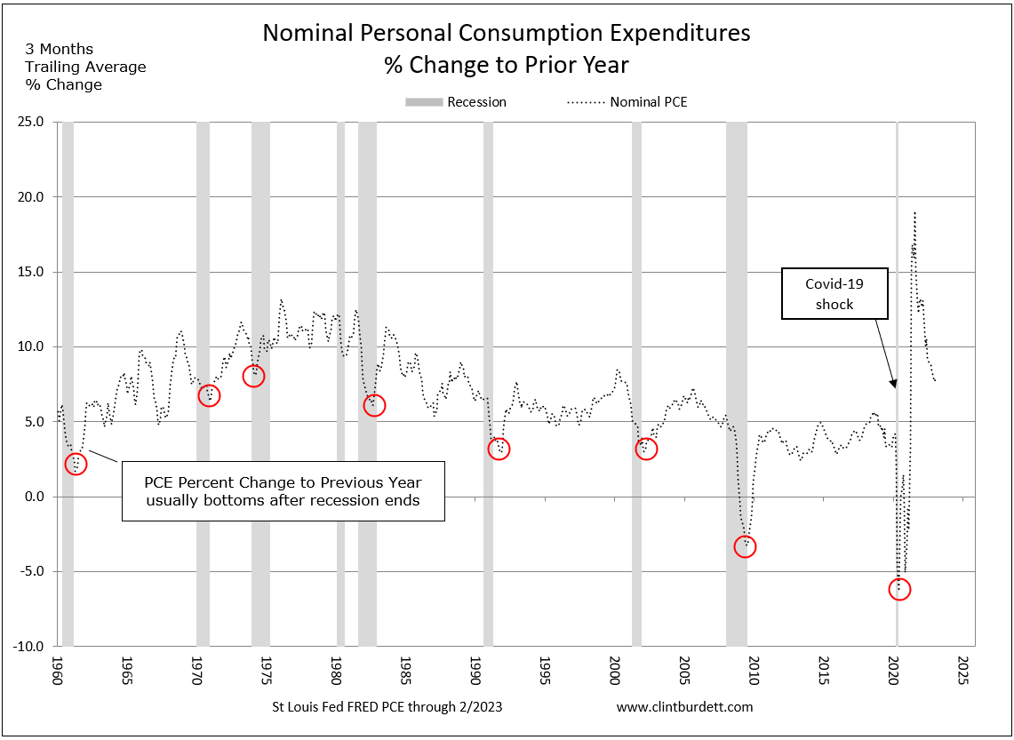
(Click to see larger image)
The chart below overlays savings rates to improve the comparison but be careful to not get too fancy!
An example of too fancy would be an extra analytical step to determine the rate of change from the previous data point in the lines. For example, nominal PCE percentage change was 1.80% YoY for month two and 1.71% YoY for month one, therefore its YoY rate of change of percentage change is +0.5% (1.80-1.71)/1.71 = 0.05. That hurts my brain ... don't get too deep into an analysis, you'll confuse people when you present the data. An eyeball calculation for the rate of change is the slope of the line. Keep it simple.
The next example compares changes in nominal PCE after the trough (the trigger) to current savings rate behavior coming off its peak (the result).
The angle of the arrows shows the lag time between starting to spend to slowing down "just in case" savings. Coming out of the Great Recession, initially there was no lag and savings rates returned to historical norms while improvements year of year in peak PCE since the mid-1970s is declining. In December 2004, mischief in the House of Representatives caused a spike in savings again showing how sensitive our use of cash (spend or save) is to events in our society.
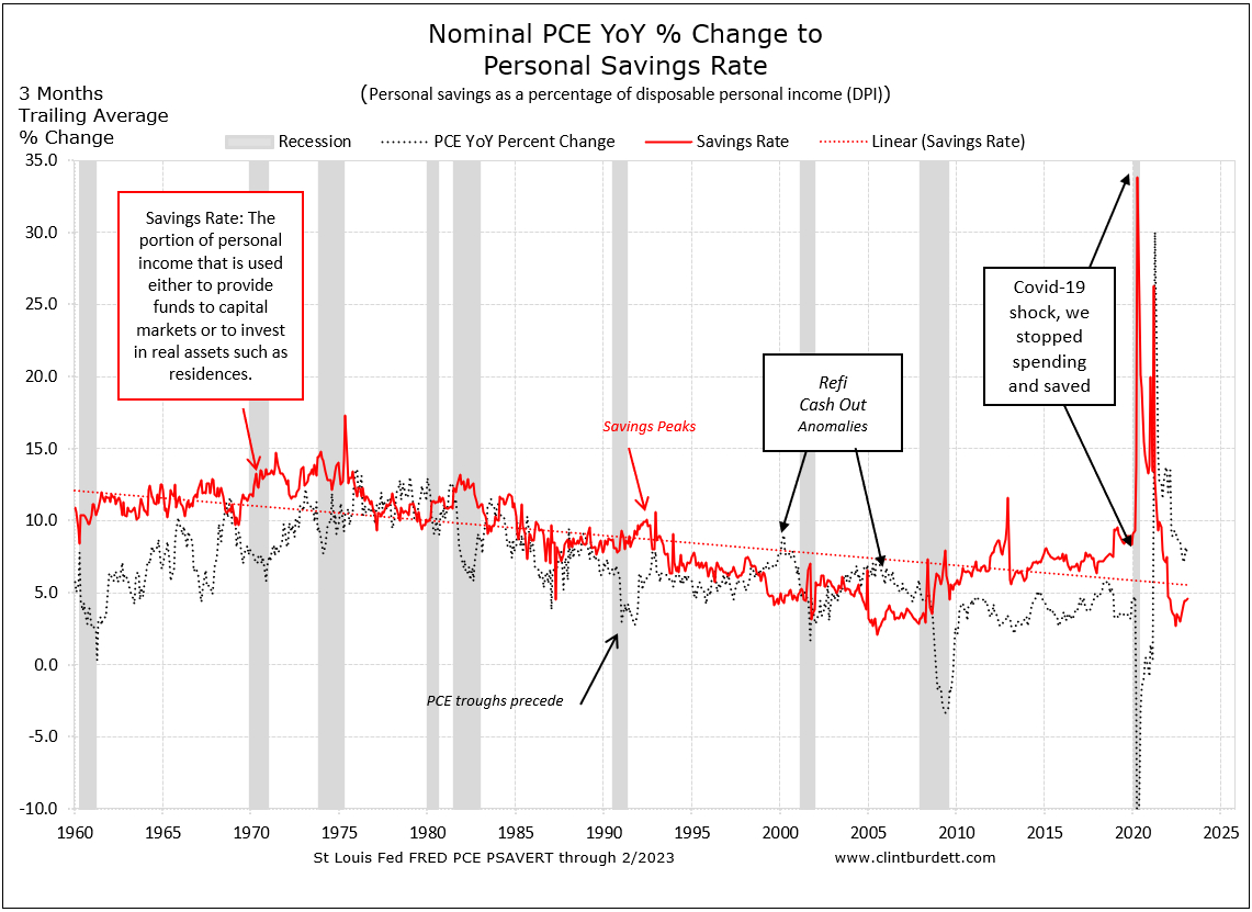
(Click to see larger image)
Average hourly earnings (total hourly earnings/total employed) drive PCE changes. With more earnings in the economy, consumers can either spend more (increased consumer demand) or set more funds aside "just in case." When the savings rates drops off, that is an indicator of future demand, which we are seeing by June 2011 though the rate is in a range more conducive to reducing consumer debt.
When more people are hired with no pressure to offer better wages (the denominator increases), we could see average hourly earnings decline. New hiring also lags in a recovery. Bosses wait to hire until they are sure and with many folks looking for work, growth in average hourly earnings can lag considerably and has not started to improve coming out of the GR, as seen in this chart.
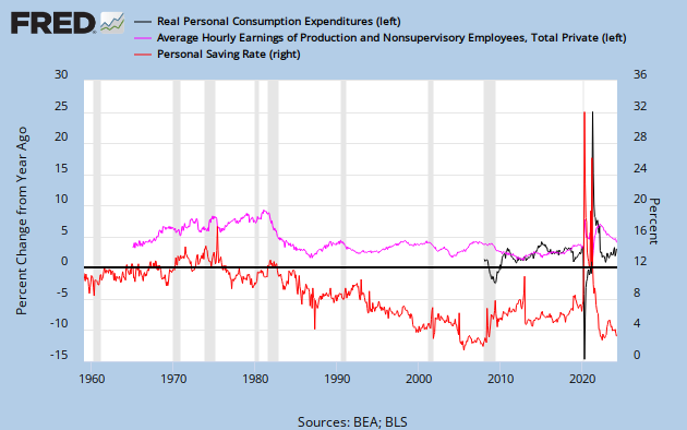
(Click to go to StLouisFed FRED graph editor)
Preparing and explaining your sales pattern compared to a national benchmark will reveal the cues to time adapting your strategy, but not everything you need to know. It is just the start of the thought process. For example an early analysis would look like this:
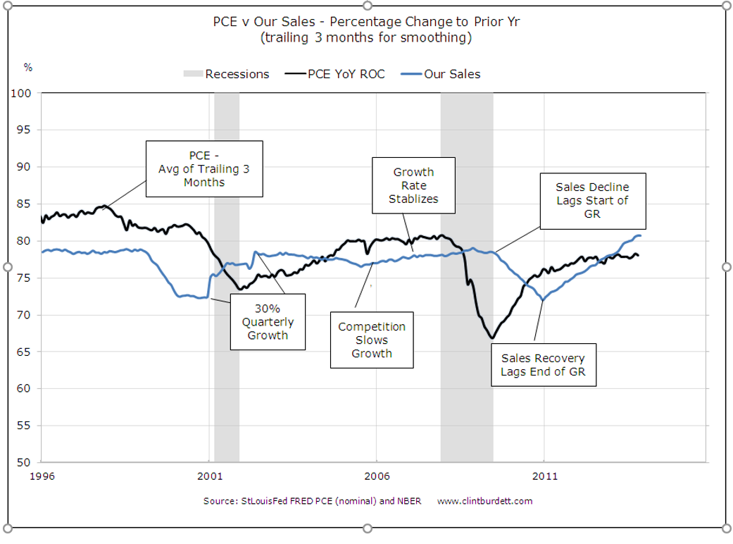
(Click to see larger image)
Key Points
A fundamental strategic planner's responsibility for positioners is to anticipate the pace of the growth or decline in consumer demand. Adding your current top line sales (or the percentage change year on year) lets you analyze the timing compared to
- Nominal or real PCE YoY changes (proxy for demand with or without inflation/deflation),
- savings rates (hoarding for a rainy day or confidence in the future) and
- average hourly earnings (expectations of future income).
Strategists, strategy consultants and facilitators should insist on sober analysis of consumer spending patterns before presenting their plans to the C level. These analyses should explain their customers' attitude about discretionary income. Ask them about their concerns, their need to save, are they seeing tax increases, do they expect a raise, are their health costs going up, can they borrow? Get a sense of how the Great Recession is changing their spending habits!

To broaden your perspective, read Joseph H. Ellis' Ahead of the Curve, A Common Sense Guide to Forecasting Business and Market Cycles. He observed that this recovery is following the 1974 pattern and suggests we need to see at least a consistent 2.0% rate of change in Real PCE growth from the previous year to spur industrial spending and then create jobs.
 Your company's people Your company's people |
|
Comparing financials  |
|